Charts in chat
An agent that has numbers to show can draw a real chart — interactive, themed, and kept with the message — by describing it as an Apache ECharts option. The platform validates the description, redacts what needs redacting, and the chat renders it with the chart library's own tooltip, legend, zoom and toolbox. The built-in Market Watcher agent is the worked example below.
What a person sees
Ask the default chat:
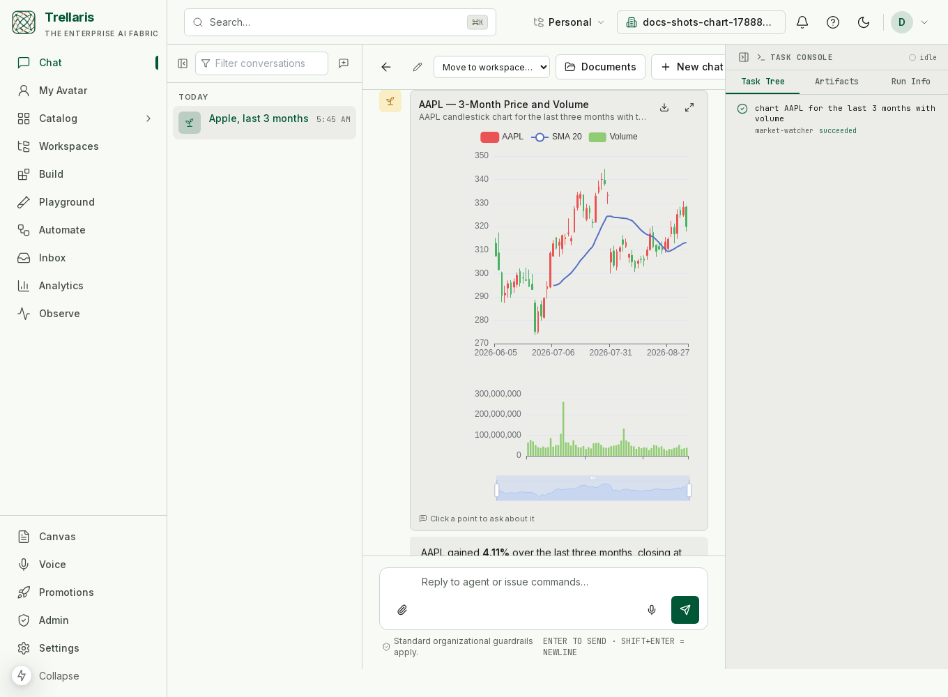
@market-watcher chart AAPL for the last 3 months with volume
A card titled AAPL — 3-Month Price and Volume appears in the thread: daily candlesticks, a 20-day moving average, a volume pane beneath, a zoom slider, and a one-sentence takeaway under it. Hover for open/high/low/close, click a legend entry to hide a series, drag the slider to zoom, save a PNG from the toolbox. Two controls are the platform's own: full screen (Esc closes) and click a point to ask about it, which puts a question about that data point in the composer.
Reloading the page shows the same chart — it is part of the message, not a live-only effect. A follow-up like add the 50-day moving average to that chart produces an updated chart in a new message; the earlier one is unchanged.
More shapes, same path
Everything below came from the same agent and the same tool, in the dark theme. The option decides the shape; the platform only checks and draws it.
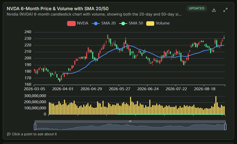
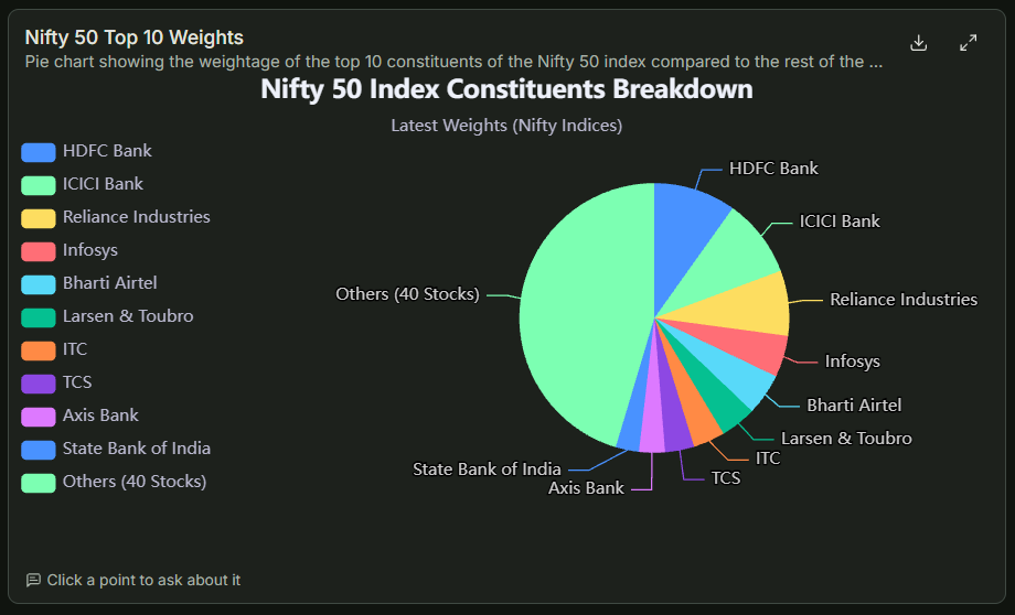
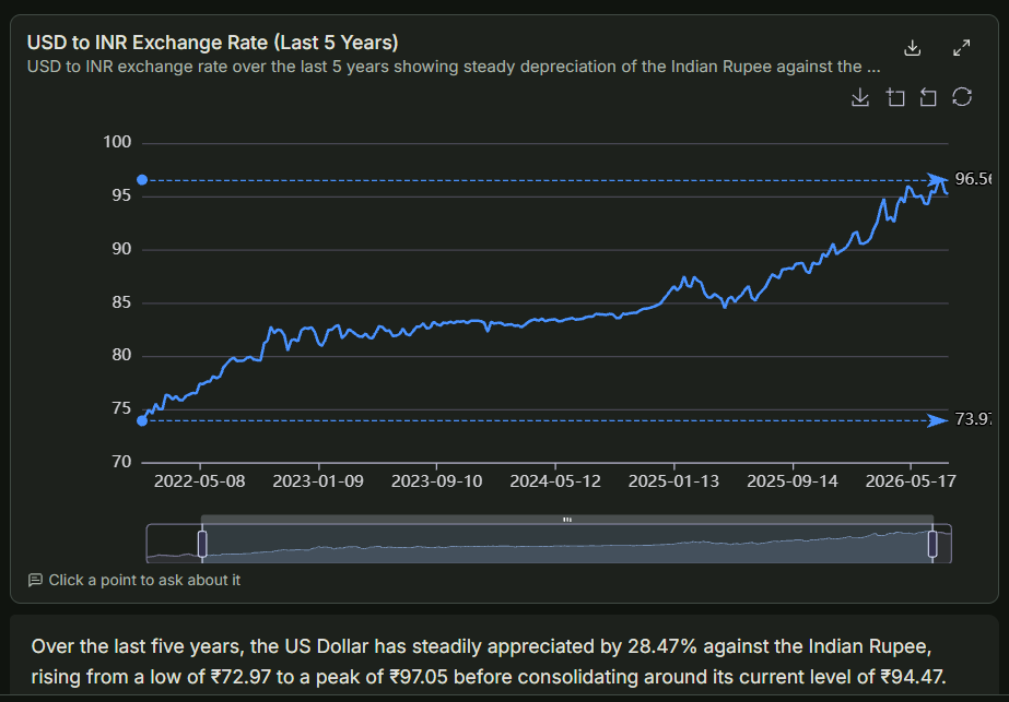
market_data tool, folded to weekly candles, with the period low and high as mark lines.Why the full ECharts grammar, not a simplified chart spec
A house schema with five chart types would throw away most of what a
chart library is for — candlesticks with a volume pane, heatmaps with a
colour scale, sankeys, treemaps, multiple axes. ECharts renders from a
single JSON option object whose grammar covers all of it,
and models have seen a great deal of it. So the option is the
wire format, and the platform polices the small set of things that
matter rather than re-describing the library.
The option is JSON, which cannot carry a function — so the classic ECharts hazards (formatter callbacks, custom render functions) are unrepresentable rather than filtered. What is left is short:
| Rule | Outcome | Why |
|---|---|---|
A series type outside the ECharts catalog | refused | a typo would render a blank card |
map series; geo components | refused | need registered map data the client does not ship |
custom series | refused | needs a render function |
| No series, or more than 40; option over 512 KB | refused | bounds |
image:// symbols and icons; image backgrounds; graphic image elements | stripped | a chart must not make the viewer's browser fetch a URL the agent chose |
| Everything else — tooltip, legend, dataZoom, visualMap, markLine, multiple grids and axes, dataset + encode… | passes through |
A refusal comes back to the agent as a tool error naming the exact field
(option.series[1].type: map series need a registered GeoJSON…),
and the model fixes it on its next turn. Nothing is stored for a refused
attempt. Strips and refusals are recorded on the run's trace, so Observe
shows them as their own steps.
The turn, end to end
- The agent calls
render_chartwith a title, the ECharts option, and optionally a stablechart_id, a height and a one-line description. - Dataset references are resolved: if a tool earlier in the run
registered rows under a name,
{"ref": "AAPL"}in the option'sdatasetbecomes those rows. - The option passes the rules above.
- Every string in the option (titles, labels, series names) passes DLP, exactly as prose would. Numbers are never touched — a card-number-looking integer in a data array is a data point, and rewriting it would falsify the chart.
- The chart is stored on the assistant message as a
chartdata part and streamed live as anartifactevent. - The tool returns a confirmation that ends with an instruction: write one sentence with the key takeaway, do not restate the numbers.
Data by reference
A tool that produces rows — market history, a query result, a connector report — registers them on the run as a named dataset with column names. The agent's option references the dataset and describes each series by column, so a 400-candle chart costs the model the option skeleton, never the candles:
{"dataset": {"ref": "AAPL"},
 "series": [
   {"type": "candlestick", "encode": {"x": "date", "y": ["open", "close", "low", "high"]}},
   {"type": "line", "encode": {"x": "date", "y": "sma20"}, "showSymbol": false}
 ]}
References are resolved before the chart is stored, so history replays without any lookup. Datasets live for the run; a follow-up turn fetches again, which is also fresher.
Updating a chart
Passing the same chart_id with merge: true
merges the new option into the most recent chart with that id — objects
merge, series arrays merge by position, data arrays are replaced — and
stores the result as a new chart marked Updated. The
earlier card is never rewritten: a transcript is a record.
Where charts are available
render_chart is offered wherever an interactive surface is:
a person is watching, in a client that can draw one (the web chat), and
the run is the one answering them — including the specialist the
orchestrator delegated to. A Slack thread or an automation never gets
the tool; an agent there falls back to a compact table. Any agent
answering in the web chat has the tool without declaring it.
Worked example: Market Watcher
Every org gets Market Watcher in its org ring beside the
Assistant, Orchestrator and ITHelp, addressable as
@market-watcher and reachable by the orchestrator's router.
It declares:
tools: [market_data, render_chart, web_search, web_fetch, calculate, current_time]
-
Fetch the data tool
market_data(["AAPL"], range="3mo")pulls end-of-day OHLCV from a keyless provider (Stooq, with Yahoo Finance as fallback), folds long histories to at most 400 candles with a proper OHLC fold, derives 20- and 50-period averages and percent change, and registers datasetAAPL. Its text result carries the summary the model answers from: last close, period change, high, low, average volume, and the last few rows. -
Draw one chart tool
The definition carries the recipe — two grids (price above, volume below), a category x-axis per grid, linked axis pointers, a cross-hair tooltip, inside + slider zoom, and three series: a candlestick (
encode.yin the order open, close, low, high), a 20-day average line and a volume bar on the second axis. For a comparison it prescribes one dataset per symbol, a time axis and the percent-change column so the lines share a scale. -
Say what it shows
AAPL rose 4.11% over the last three months, currently above its 20-day average despite a pullback from the period high. One or two sentences from the numbers the tool gave; never the table again.
-
Explain a move, only when asked web
For "why did it drop",
web_searchandweb_fetchfind and read one or two sources, named in the answer, with the chart kept.
Boundaries it keeps: data is end-of-day and says so; it describes markets and never advises — no buy, sell or hold, and "Not investment advice." once when an answer touches a decision. The recipes live in the agent's definition, so an org can edit its own copy without a deployment.
Adding charts to your own agent
There is nothing to enable: in the web chat the tool is already there. What decides whether an agent uses it is the definition. A paragraph like this in the Agent.md body is a good start:
# Charts
When an answer is numeric across three or more categories or five or more
time points, draw it with `render_chart` (a full ECharts option: line for
change over time, bar to compare categories, pie or treemap for shares,
scatter for correlation, boxplot for spread). Always include `tooltip`, a
`legend` when there is more than one series, and `dataZoom` for long time
ranges. Give the chart a stable `chart_id` and use `merge: true` to update
it on a follow-up. After the call, write ONE sentence with the key takeaway;
do not repeat the numbers as a table. Never chart a single number.
If your agent has a tool that returns rows, have the tool register them
as a dataset and say so in its result ("dataset sales is
registered with columns region, q1, q2, q3, q4 — reference it as
{"ref": "sales"}"). The model then charts by column name
instead of copying the numbers. Listing render_chart under
tools: is optional and documents intent; it does not offer
the tool outside the web chat.
Troubleshooting
| Symptom | Cause | What to do |
|---|---|---|
| The agent describes the chart in prose or pastes JSON | The run is not in the web chat (Slack, an automation, an API run), so the tool was not offered | Use the web chat |
| Tool error mentioning GeoJSON | A map series or geo component | Not supported; use a bar or treemap by region |
unknown dataset 'X' | No tool registered that name this run | Call the data tool first, in the same turn |
| Candles look inverted | Wrong encode.y order | Must be open, close, low, high |
A label reads [REDACTED] | DLP matched a string | Expected; the numbers are unaffected |